Advanced fcm tutorial
Graphics
fcm provides several convenience functions for plotting common flow cytometry plots. These include fcm.graphics.hist(), fcm.graphics.heatmap(),
Histogram using graphics.hist()
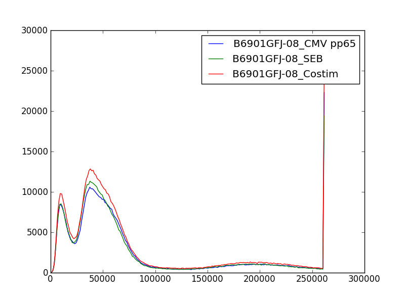
fcm.graphics.hist() plots overlay histogram for the specified channel.
In [1]: import fcm

In [2]: import fcm.graphics as graph

In [3]: from glob import glob

In [4]: xs =[fcm.loadFCS(x) for x in glob('B6901GFJ-08_*.fcs')]

In [5]: graph.hist(xs,3, display=True)
Pseudo-color plots using fcm.graphics.heatmap()
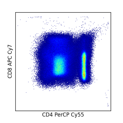
fcm.graphics.heatmap() provides a quick function to generate pseduo-color scatter plots. Multiple pairs of channels passed as tuples can be passed to generate multiple plots at once. If you wish to generate your own heat maps, fcm also provides fcm.graphics.bilinear_interpolate() and fcm.graphics.trilinear_interpolate() to calculate the intensity at a given point.
In [1]: import fcm

In [2]: import fcm.graphics as graph

In [3]: x = fcm.loadFCS('B6901GFJ-08_CMV pp65.fcs')

In [4]: graph.pseduocolor(x,[(7,12)])
View logicle transformed axis
Often when viewing logicle transformed data it is desirable to see the scale units in the original transformed data. fcm.graphics.set_logicle() will set the axis units on a plot to the original untransformed scaling. fcm.graphics.set_logicle() takes a matplotlib axis object and a string of 'x' or 'y' and sets the scale of the axis as appropriate.
Automated positivity thresholds
fcm provides a method for automatically determining positivity thresholds on fcm data, by comparing a positive and negative control sample. Gate objects for this are generated by the fcm.generate_f_score_gate() taking a negative sample, a positive sample, and the channel to compare.
Clustering
The fcm.statistics module provides several models to automate cell subset identification. The basic models are fit using k-means by fcm.statistics.KMeansModel and or a mixture of Gaussians by fcm.statistics.DPMixtureModel. Models are thought of as a collection of model parameters that can be used to fit multiple data sets using their fit method. fit methods then return a result object describing the estimated model fitting (means locations for fcm.statistics.KMeansModel, weights, means and covariances for fcm.statistics.DPMixtureModel)
Clustering using K-Means
In [1]: import fcm, fcm.statistics as stats
In [2]: import pylab
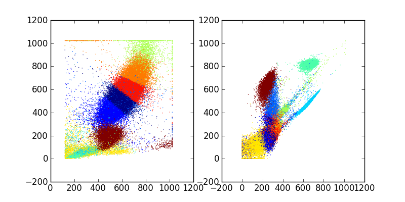
In [3]: data = fcm.loadFCS('/home/jolly/Projects/fcm/sample_data/3FITC_4PE_004.fcs')
In [4]: kmmodel = stats.KMeansModel(10, niter=20, tol=1e-5)
In [5]: results = kmmodel.fit(data)
In [6]: c = results.classify(data)
In [7]: pylab.figure(figsize=(8,4))
Out[7]: <matplotlib.figure.Figure at 0x821a18050>
In [8]: pylab.subplot(1,2,1)
Out[8]: <matplotlib.axes.AxesSubplot at 0x81b3ca0d0>
In [9]: pylab.scatter(data[:,0], data[:,1], c=c, s=1, edgecolor='none')
Out[9]: <matplotlib.collections.CircleCollection at 0x81b3eab90>
In [10]: pylab.subplot(1,2,2)
Out[10]: <matplotlib.axes.AxesSubplot at 0x81b3b3690>
In [11]: pylab.scatter(data[:,2], data[:,3], c=c, s=1, edgecolor='none')
Out[11]: <matplotlib.collections.CircleCollection at 0x827d0ee10>
In [12]: pylab.savefig('kmeans.png')
produces
Clustering with Mixture Models
An alternative to simple k-means models to describe the distribution of flow data is to use a mixture of Gaussian (normal) distributions, and use the probability of belonging to each Gaussian to assign cells to clusters. The :py:class`fcm.statistics.DPMixtureModel` is used to describe these mixtures of Gaussians and estimate the weights (pis), means (mus), and covariances (sigmas) of the distribution. Using the dpmix module we have two methods of estimating these parameters, Markov chain Monte Carlo (mcmc) and Bayesian expectation maximization (BEM)
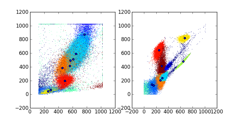
Fitting the model using MCMC
In [1]: import fcm, fcm.statistics as stats
In [2]: import pylab
In [3]: data = fcm.loadFCS('/home/jolly/Projects/fcm/sample_data/3FITC_4PE_004.fcs')
In [4]: dpmodel = stats.DPMixtureModel(10, niter=100)
In [5]: dpmodel.ident =True
In [6]: results = dpmodel.fit(data,verbose=10)
starting MCMC
-100
-90
-80
-70
-60
-50
-40
-30
-20
-10
10
20
30
40
50
60
70
80
90
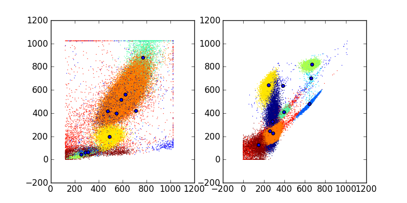
In [7]: avg = results.average()
In [8]: mus = avg.mus()
In [9]: c = avg.classify(data)
In [10]: pylab.figure(figsize=(8,4))
Out[10]: <matplotlib.figure.Figure at 0x823663ed0>
In [11]: pylab.subplot(1,2,1)
Out[11]: <matplotlib.axes.AxesSubplot at 0x8287bad10>
In [12]: pylab.scatter(data[:,0], data[:,1], c=c, s=1, edgecolor='none')
Out[12]: <matplotlib.collections.CircleCollection at 0x8287ce750>
In [13]: pylab.scatter(mus[:,0], mus[:,1])
Out[13]: <matplotlib.collections.CircleCollection at 0x8287ce450>
In [14]: pylab.subplot(1,2,2)
Out[14]: <matplotlib.axes.AxesSubplot at 0x8287ce8d0>
In [15]: pylab.scatter(data[:,2], data[:,3], c=c, s=1, edgecolor='none')
Out[15]: <matplotlib.collections.CircleCollection at 0x829038d90>
In [16]: pylab.scatter(mus[:,2], mus[:,3])
Out[16]: <matplotlib.collections.CircleCollection at 0x829038a50>
In [17]: pylab.savefig('dpmix.png')
Fitting the model using BEM
In [1]: import fcm, fcm.statistics as stats

In [2]: import pylab

In [3]: data = fcm.loadFCS('/home/jolly/Projects/fcm/sample_data/3FITC_4PE_004.fcs')

In [4]: dpmodel = stats.DPMixtureModel(10, niter=100, type='bem')

In [5]: results = dpmodel.fit(data,verbose=10)
starting BEM
0:, -941157.006634
10:, -158859.825045
20:, -144465.587253
30:, -111709.700352
40:, -111378.962977
50:, -111366.297392
60:, -111365.592223

In [6]: mus = results.mus()

In [7]: c = results.classify(data)

In [8]: pylab.figure(figsize=(8,4))
Out[8]: <matplotlib.figure.Figure at 0x8230a8c90>

In [9]: pylab.subplot(1,2,1)
Out[9]: <matplotlib.axes.AxesSubplot at 0x81b7503d0>


In [10]: pylab.scatter(data[:,0], data[:,1], c=c, s=1, edgecolor='none')
Out[10]: <matplotlib.collections.CircleCollection at 0x8287c1810>

In [11]: pylab.scatter(mus[:,0], mus[:,1])
Out[11]: <matplotlib.collections.CircleCollection at 0x8287f03d0>

In [12]: pylab.subplot(1,2,2)
Out[12]: <matplotlib.axes.AxesSubplot at 0x808e03d50>

In [13]: pylab.scatter(data[:,2], data[:,3], c=c, s=1, edgecolor='none')
Out[13]: <matplotlib.collections.CircleCollection at 0x827cef790>

In [14]: pylab.scatter(mus[:,2], mus[:,3])
Out[14]: <matplotlib.collections.CircleCollection at 0x827cef410>

In [15]: pylab.savefig('bem.png')